It's easy to find out…go to https://www.google.com/webmasters/tools/mobile-friendly/ and enter your site's URL.
And you'll get your answer…..Sandi's site is mobile-friendly! This site, Blogs By Heather is not! So we'll go thru that later….
Review of Terms
Let's review quickly two terms you probably keep hearing, Responsive and Mobile-Friendly. They are two separate things. Your site could be Responsive, but not Mobile Friendly.
Responsive means that it auto-resizes to fit any screen…whether it's your desktop, laptop, iPad or smart phone. For example, you can see this site on your smart phone, it resizes beautifully…but can your read it?
That leads us to Mobile Friendly….Just because a website or blog is responsive and can be scaled proportionally, it's usability and readability is not so good.
A site is mobile-friendly if it can be easily read and navigated from your smart phone without having to take out a magnifying glass or zooming in to read a blog post.
So, when a site is Mobile-Friendly is contains the same great information, but appears in a different layout. Check out Sandi's site for a great test. http://stampinwithsandi.ca. Look at it both on your ipad or desktop and then watch it change when you visit it from your smart phone!
Many mobile-friendly sites have the form of a logo at the type (in place of a banner), and a vertical layout of your navigation bar, followed by excerpts of your blog posts, and then your sidebar elements are normally towards the bottom of the page, again in a vertical layout. Sandi's is beautiful :D
So, how do you fix it? How do you make your site Mobile Friendly?
Let's review Blogger, TypePad and WordPress.
Blogger Responsive,
Mobile-Friendly Design
Well, you have to figure this one would be 1-2-3 easy and it is! Google Blogger has a Mobile layout built-in. You just have to turn it on and viola!!! Done. In seconds!!!!!!
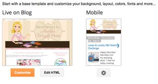
From your Dashboard, go to Layout and there is the Mobile layout!
 Click on the Settings icon, I chose the layout on the right and clicked Save! That's it. This was available long before Google's April 21st announcement.
Yea Blogger!!!! Check out my old paper crafting site, http://handstampedbyheather.com, on your laptop, ipad, and then via your smart phone.
Again, this video will be a snap for us to create for you at Stamping and Blogging. Stay tuned 😀
WordPress Responsive,
Mobile-Friendly Design
Many WordPress themes are Responsive and Mobile-Friendly, such as Sandi MacIver's new Canadian blog: http://stampinwithsandi.ca. Check it out on your desktop and iPad. Then go to that site via your smart phone and check out how easy it is to now navigate the site and be able to "read" everything.
When choosing a WordPress theme for your site, be sure to read the description and that it's at least Responsive. Although a WordPress themes may be Responsive, it may not mobile-friendly yet, so you'll need to add a plugin. Most popular are:
In Stamping and Blogging, we'll experiment and create videos for WP Touch…I'll let you know when it's ready 😀 If you need help setting up a new WordPress blog or installing a new Mobile Friendly theme, contact me.
TypePad Responsive,
Mobile-Friendly Design
TypePad will be the more challenging change for many of us that have custom designs. You can see here in my mini-tutorial on switching to a Responsive Design and using CSS code to load the custom banner. TypePad Everything support jumped in to share with us special code that would help the custom banner become "responsive".
However, TypePad also shared this tip in their article (on how to optimize your blog for mobile devices) for those using the Classic Theme Builder, which many of my clients do…so this may help get you started….(but it's only for BETA users at present).
At Design > Theme Builder, check the Create as Responsive box and click Save Changes to make an existing design responsive. To create a new theme, go to Design > Choose A Theme, select Theme Builder, and click Choose. Then, you'll have the option to Create as Responsive and apply the new design to your blog.
Lastly, TypePad shares this article in response to how to make your TypePad blog mobile-friendly.
So I will share with you my experience as I transform this site, Blogs By Heather from Advanced Templates to a Responsive Design. The biggest challenge I'm thinking will be the dropdown menu….but we'll see 😀
(Updated May 11, 2015) I will use one of my customer's sites as an example. I'm actually preparing to move over to WordPress and can instead share with you how I do that!
Additionally, in Stamping and Blogging we're creating videos on how to convert to a Responsive Design using one of the three Responsive theme TypePad has available currently for all users.
What happens if your site is
NOT Mobile-Friendly?
In closing, this new Google algorithm does not impact your desktop search results ranking. It only impacts your mobile-ranking and how Google identifies and lists those sites resulting from a search people are doing from their smart phones (mobile devices).
So first, make sure your site is at least Responsive. And then follow the above tips to make it Mobile Friendly or join Stamping and Blogging for step-by-step videos!


The option to check the “create as responsive” option in the Theme Builder for Typepad is only available for Beta Users. What are you thoughts about being a beta user?